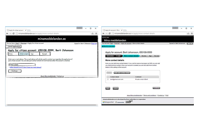
 Early UI sketch (to the left) and prototype of beta version (to the right). In the beginning the project was called “Mina meddelanden”. The sketch shows an idea of a highly opinionated team member – to keep a separate e-mail address for the application process. After feedback from users we changed that idea. Translated from Swedish to English for this portfolio.
Three governmental authorities in Sweden were collaborating to create a webmail application secured by the Swedish electronic ID system “e-legitimation”. The purpose was to enable all Swedish authorities to send messages digitally without violating the security requirements that deny them to send personal information via regular e-mail. The primary target group was companies, with citizens as the secondary. My job in this project was designing the user interface of the mailbox of the receiver (the company or citizen). For political reasons the directions for the first version was to give a cheap impression. Later I was asked to design the app, and I convinced them of the need to make a revamped website with responsive design.
Approach
Being the only one in the project with a background in design I was the one leading the design process of the user interface. Apart from taking part in discussions on a technical and judicial level I also:
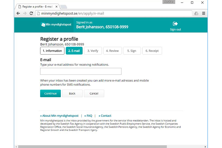
- Created simple user interface sketches and prototypes to catalyze discussions.My sketches and prototypes were, as always, my most important tool to encourage people to share their ideas and to understand their needs. They were always the center of attention, be it in interviews and tests with users, technical discussions with developers or strategic discussions with the project managers. The sketches and prototypes were constantly improved in a truly iterative manner.
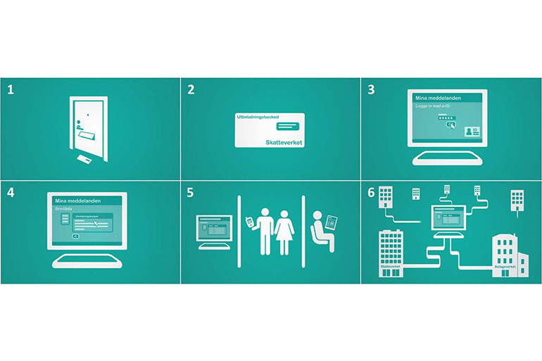
- Created video prototypes that were used to introduce the concept.On many occasions, there was a need to introduce people to the concept. Early on I created one simple video by myself, and later I produced one that was a bit more polished (watch it below). I used the videos as an introduction to the surveys and other team members showed them at conferences and other meetings.
- Performed qualitative interviews with the prioritized target groups.By the start of the project there was already a lot of knowledge of the users. Some of it was in the shape of personas from earlier projects with similar target groups, and some of it was in the heads of the team members. Still I did perform a fair amount of interviews with the users. Through these interviews I gathered a large amount of ideas on how to develop the service concept. It also made me realize that the target group definitions we had were not the most important factor in determining the need for the service. With the help of this new understanding we could more clearly talk about the users and make better prioritization between different ideas. I also identified a large group that did not see the benefit of the service. This was important input in our discussions of marketing the service.
- Created surveys to gather quantitative data.The project management requested quantitative data to inform their decisions. Thus I created a couple of surveys that further explored some of the findings from the qualitative interviews. The surveys led to greater acceptance of the results from the qualitative design research. The results from both surveys and qualitative interviews were merged with the results of other processes of requirement analysis and presented to decision makers at a high level in the client organizations.
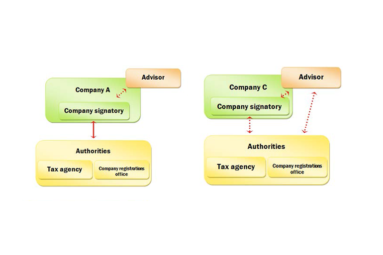
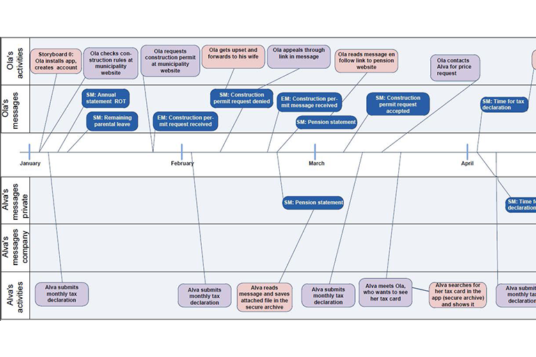
- Visualized a timeline with the flow of messages for the prioritized target group.Many project members were very focused on the creation of the website itself so I felt the need to put the use of the website in context. Inspired from the interviews with users and the visionary ideas of the service I visualized a timeline with examples of messages. This was an excellent tool to change focus when discussions went deep down a one way street.
- Collaborated closely with the front-end developers in an agile environment to ensure high quality in implementation of the design.The prototype was the most important specification of the GUI, and even though it was quite detailed there were many things to be discussed with the developers. Often I would sit next to the developers and discuss the code together.
- Evaluated the final web site with respect to accessibility (WCAG).Being a service for all citizens of Sweden there was high interest of making it accessible for all. I performed an evaluation based on the Web Content Accessibility Guidelines and reported a list of suggested improvements.
Video prototype 2. This video was used to introduce the concept to users that would reply to a survey. English subtitles created for this portfolio.
Personal learnings
Working on a service that targets 10 million users was an exciting challenge! The fact that there were three clients (the three authorities), each of which had a complex and highly opinionated management structure, presented even more challenges. This taught me a lot about how to navigate in large organizations and the importance of connecting with the decision makers. It gave me good practice in championing for the users’ needs while facing technical, judicial or political obstacles on the way to a great user experience. I learned the importance of having a strong vision in order to get everyone to work towards the same goal. Lastly, it became very clear to me that working towards a product of high quality is much more motivating than when the client asks for a feeling of simple and cheap.