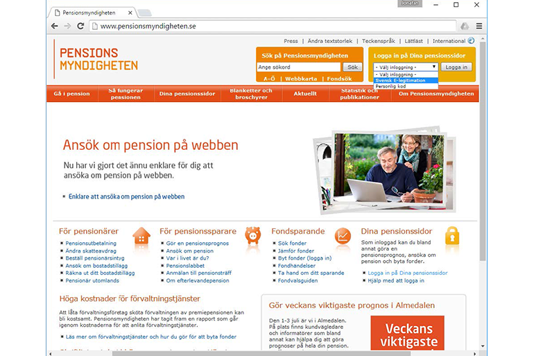
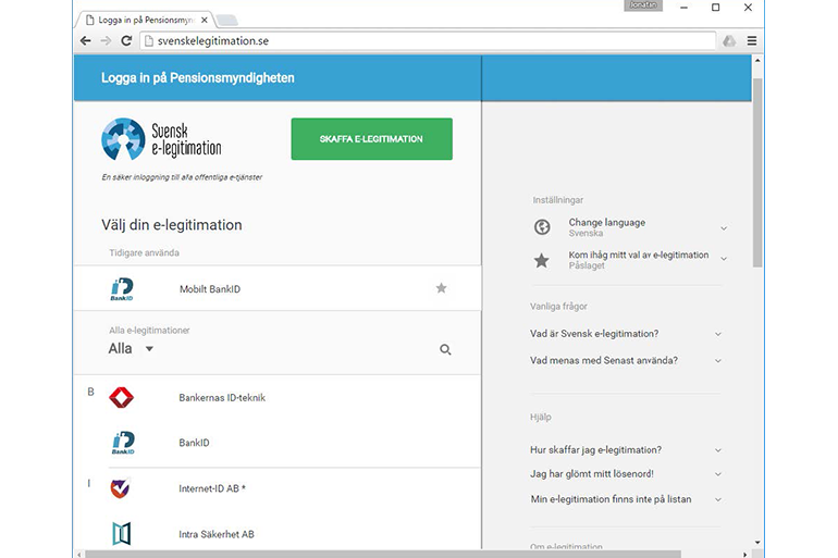
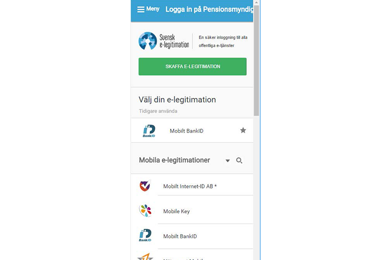
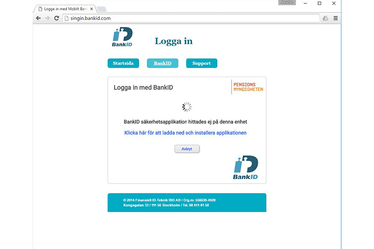
The Swedish E-identification Board is a public authority with the task to promote and coordinate electronic identification and signature for the public sector e-services in Sweden. The board was working on a new version of the electronic identification and signature framework, and needed help with the design and development of a new responsive UI. I managed a project with six team members – UX designers, visual designers and coders. We designed and developed a new version of the UI for choosing your e-ID provider, which is part of the identification process of public e-services in Sweden.
Approach
I took the main responsibility for contact with the client and overall project planning. I also managed the team to:
- Perform design research to understand user needs as well as framework limitations.The team built on earlier experience from designing services using e-ID as well as interviewing new users. We also organized workshops for various actors involved in the different parts of the service.
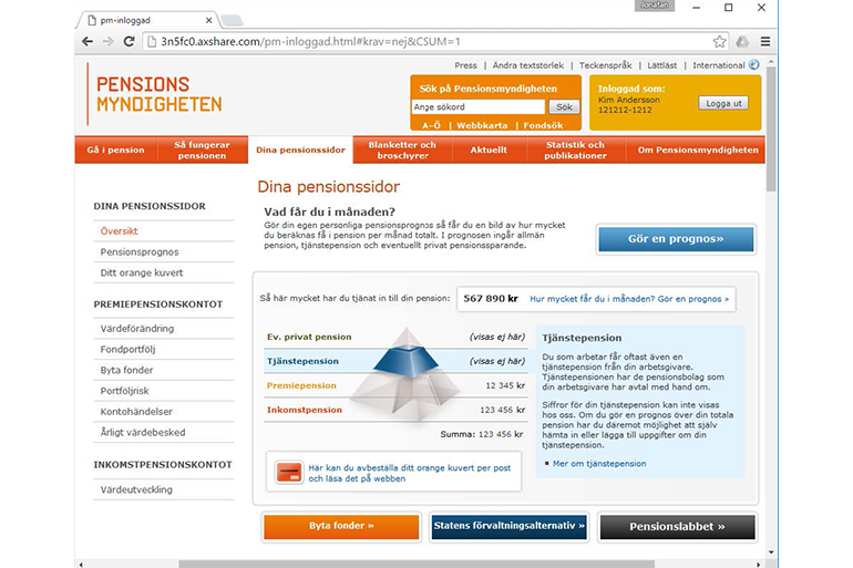
- Iteratively design the new UI with input from users and other stakeholdersIn order to minimize the time to get started with testing with users we modified current websites and integrated our prototype (see figure 1, 4 and 5 above). This was a quick way to put the vision of the UI into context.
- Develop the new UI with an agile approach.Our developers worked with the prototype as a design specification in their agile approach to coding the UI functionality integrating with the already existing backend.
- Ensure compatibility with multiple platforms and accessibility tools (WCAG).We made sure to follow WCAG 2.0 level AA in the design as well as coding of the UI. We tested the UI with screen readers.
- Write a report on results from tests with users as well as suggestions for framework development.We delivered two reports, one documenting our work, insights and conclusions. The other following the ISO/TS 20282:2013 standard for reports of summative test methods for usability of products for public use. The latter was based on a specific request from the client.
Personal learnings
Managing a multi-disciplinary team to design and develop a new responsive UI was a challenging, and thus exciting task. Being the information hub between my team, the client and other stakeholders, I learned a lot about the importance of communication. I also improved my understanding of what my responsibilities are as a consultant, and what the responsibilities of the client are. I realized that I sometimes take on too much responsibility in relation to my mandate. My goals were set much higher than we had a possibility to complete given how detailed the framework was already specified. This was a tough challenge, but in the end our work resulted in a complete rework of the framework, which feels like a great success.
